
Hey Flutter friends!
How many times have you reached for a third-party package just to get a decent, modern-looking carousel? Too many, right? We’ve all been there, trying to wrestle a PageView into a custom, dynamic layout.
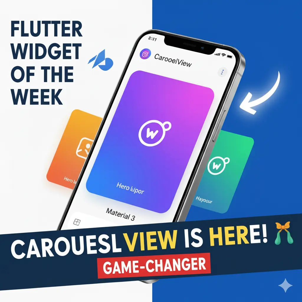
Well, if you haven’t seen the recent “Widget of the Week” video on the CarouselView, stop what you’re doing! This new widget (introduced in Flutter 3.24) is a native, built-in solution that delivers those slick, dynamic Material 3 layouts we’ve been craving. Let’s break down how easy this thing is to use.
1. The Essential Setup (It’s Less Scary Than You Think)
To get your scrollable list of widgets up and running, there are two key pieces of code you need to think about:
A. The Controller is Your Conductor
Just like a ListView has a ScrollController, the CarouselView needs a CarouselController. This is how you manage its state and interact with it programmatically.
Dart
// Step 1: Create the controller
final CarouselController _carouselController = CarouselController();

// You can optionally pass an initial index here!
B. The Non-Negotiable itemExtent
This is probably the most crucial property. The itemExtent is the fixed width (or height, if scrolling vertically) of your item.
💡 Pro Tip: Because carousels are scrollable and have an unconstrained width, you must wrap your
CarouselViewin something with an explicit height (like aSizedBoxorConstrainedBox) to avoid render overflow errors!
Here’s the basic boilerplate code:
Dart
SizedBox(
  height: 200, // You need to give it a height!
  child: CarouselView(
    controller: _carouselController,
    itemExtent: 300.0, // Defines the width of each item
    children: const [
      // Put your cards, images, or custom widgets here!
      Card(child: Center(child: Text('Item 1'))),
      Card(child: Center(child: Text('Item 2'))),
      // ... and so on
    ],
  ),
)
2. The Real Showstopper: Material 3 Layouts
The thing that makes CarouselView a huge win is its support for the four core Material 3 carousel layouts. You can achieve radically different effects just by changing the constructor you use!
A. The Default & The Edge-to-Edge Scroll
When you use the standard CarouselView() constructor, you get the Uncontained Layout. This is the classic look where items scroll right up to the edge of the container.
B. The Weighted, Dynamic Layouts
This is where the magic happens. For dynamic item resizing—where the items shrink and grow as they scroll—you switch to the CarouselView.weighted constructor and use the flexWeights property. This property works just like the flex value in a Row or Column, determining the relative size of the visible items.
1. The Hero Layout (The Focus)
Want one big, “hero” item centered, with small hints of the next/previous items on the sides? Use a simple three-weight list to emphasize the middle!
- What it does: Shows at least one large and one small item.
- Example Weights:
flexWeights: const <int>[1, 5, 1]- (The ‘5’ weight item is the giant focus in the center!)
2. The Multi-Browse Layout (The Panorama)
This layout is fantastic for previews, showing a variety of content sizes at once to give the user a good overview.
- What it does: Shows at least one large, medium, and small item simultaneously.
- Example Weights:
flexWeights: const <int>[1, 2, 5, 2, 1]- (This creates a central focus with a gradual fade-out size on both sides.)
3. Full-Screen Layout (The Gallery Look)
If you want a pure, single-image gallery that takes up the entire space, both constructors support it!
- Using default constructor: Set
itemExtent: double.infinity. - Using
.weighted: SetflexWeights: const <int>[1].
3. Pro-Developer Polish: Snapping & Control
To make your carousel feel truly premium, don’t forget these two properties:
itemSnapping: true: This is a must-have! It ensures the carousel snaps precisely onto the next item when the user lets go, rather than stopping randomly between two. It just makes the experience feel solid.- Programmatic Control: Remember that
CarouselController? You can use it to build external controls like “Next” and “Previous” buttons or auto-play logic:
_carouselController.animateToPage(5); // Or just jump instantly:
_carouselController.jumpToPage(5);
In short, if you need a dynamic, smooth, and Material 3-compliant scrolling experience, stop hacking other widgets and just use the native CarouselView. It’s clean, efficient, and finally gives us the dynamic carousel we deserved!
Happy Flutting! 🚀
Want to see it in action? Watch the original “Widget of the Week” video that inspired this breakdown! [🔗 CarouselView (Widget of the Week) on YouTube]
Leave a Reply